rlmccarty2000
Active member
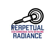
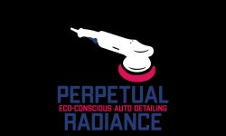
Looks like pimp my ride font IMO.
Logo needs to match the clientele you have/are hoping to acquire.
That does look like the “Pimp my Ride” font. Lol. I liked that show.
Follow along with the video below to see how to install our site as a web app on your home screen.
Note: This feature may not be available in some browsers.
Looks like pimp my ride font IMO.
Logo needs to match the clientele you have/are hoping to acquire.


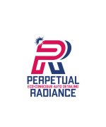
If I were to be searching the web the name and logo would be what would draw me in. The first couple wouldn`t do it for me, in fact would turn me away. But that last one is very simple and professional looking and would draw me in to look further.
quebert- Yeah! The version with a Red "P" works best for me. The basic design is really good IMO, and the different colors make it just right, easy to figure out.
The color version of the newest logo looks really good. The font is great and having "Auto Detailing" there is a win. One thing: to me, the star burst that should look shiny instead looks like a collision symbol. I think something a little lighter weight will say "radiance" better. It`s a minor quibble.
For me, I kinda dig the Perpetual Radiance thing and even the shield but I`d bag the crown.
The `Vehicle Detailing` thing I`d rethink, just doesn`t roll off of the tongue. Unless you`re specifically shooting for big rigs and/or boats, I`d think Automotive Detailing would be better.
Don`t at all like the Infinity Swoosh and the font that goes with it in your other design...a bit cartoonish to me.
Even if you ditch the Shield for something a bit simpler, I personally like the Perpetual Radiance thing...classy to me.
In the end, just my thoughts...consider them the `lowest common denominator` view from a simpleton`s mind
Edit: Images towards end didnt load before I started babbling but I think this is pretty cool. Maybe plays around with some thicker fonts for the Auto Detailing subtext, no curvy stuff though...upright, straight, classy.

 But maybe you oughta buy one pair just to scratch that itch and see if you ever wear `em (more than once
 ") ).
).I get what you`re saying about the star burst, but since it will be stitched on a shirt I`m not exactly sure there`s a way to make it look shiny. LOL collision symbol, after reading that I can`t stop seeing it.

Okay, so I used my barely passable image editing skills and tried to incorporate a shine thing.