Logo + name feedback

quebert

Member
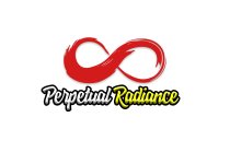
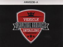
I was a part time detailer, the bulk of my stuff got stolen so I took an extended leave. I had a web site and shirts and business cards. What I came to understand from a lot of the people who became clients. The name was too confusing, and maybe it is sort of nonsensical. I thought initially it sounded cool, then I paid to have a logo digitized and 10 button up shirts made, so I was kind of stuck with it at that point. Nobody said much about the logo when I asked except a few "Yeah, I like it" but some people like anything lol. I decided I want to get back into detailing. I probably need to change the name to something more basic, and the logo, well I do like it somewhat. But I also don`t love it. Any feedback here would be greatly appreciated. The name was obviously Perpetual Radiance, doubtful anyone remembers it, as it`s a weird name that probably is impossible to remember.

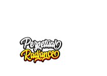
Naturally, I can`t find the final logo I made, this was my next to last, and the font`s very different where it says vehicle detailing and the Perpetual Radiance was in the same, but like a light version of the font. Outside of that it`s identical. So imagine those 2 words, I dunno with a better looking font? And my feelings can`t be hurt, any words will give me something to go on.

attachment.php
 

Attachments

  • logo.jpg
    logo.jpg
    395.5 KB · Views: 123
Of course right after I posted, I sort of found the final logo. This is a scan of the logo the place that digitized the logo and made my shirts sent me for approval. You can at least see the proper font, I`m remember now the font change was their idea. They do this for a living so I listened to their advice. This is a stitched logo, so that`s why it looks sort of rough in some places. IMHO it looks better on my actual shirts and jackets. I only have stitched stuff nothing printed.

attachment.php
 

Attachments

  • 3236-A.jpeg
    3236-A.jpeg
    23.2 KB · Views: 134
quebert- IMO the upper image, which I gather is a crown on top of ...[something?]...doesn`t have any tie-in to "Radiance" or the rest of it.
 
So are you going to change the name or keep it? Your post wandered.

Getting straight to the point, it’s a little confused.

Perpetual radiance is a little sophisticated and difficult to make the detailing connection but it’s not a deal breaker.

To make the name work, the logo needs to work harder. It would be beneficial to go with something that has remote significance to either word and the work you do.

At the moment it tends to look like a template that you’ve put a name on. I can see a shield, a scroll, a crown and some stars.

If the logo said “Shield King”, sense is made.

Either keep the logo or keep the name but reconsider keeping both.

Good points, I`m not sure if I`m going to keep either. That wasn`t my original name, I don`t even remember my original name lol. I see what you`re saying about the lack of connection between the name and the logo. I was thinking about that as I was trying to finalize the logo before I had shirts and business cards made. I ran it by random people I came across, some thought the name sounded cool. But honestly only a couple understood it. So nobody was telling me they thought the logo didn`t work with the name. But that was because the name was foreign to them. So I kind of thought "hummm, if they don`t get the name, maybe the logo will be okay" When I initially thought of the name, I did try and design a logo that fit with the name, but I couldn`t. Heck, maybe I don`t even understand the name lol. And it doesn`t help I had about an even number who liked the name but didn`t have an opinion on the logo. And ones who liked the logo but didn`t really have an opinion on the name. And no loss on the web site, as perpetualradiance.com was already taken so I used perpetualradiance.us. As if the name wasn`t already hard enough for people to remember and know how to spell, having a .us domain on top of that. I might as well not even had a web site. I just checked on Godaddy and perpetualradiance.com is up for sale for $1888. And under why it`s great they actually put "perpetualradiance.com is easy to remember" the hell it is! lol. As much as I liked the name, for whatever reason. Even before I started I knew people would have a hard time remembering it.

I think you are correct on your last line. So now I need to figure out which will be easier, coming up with a new name or designing a new logo.


Thank you to everyone who`s replied thank you much, I really was stuck here, and now I have some ideas of a direction I need to go. Which is a good start. I am sitting on $400 of shirts + a jacket, but sometimes it`s best to start fresh.
 
It’s a tough decision to make but it’s necessary.

Having the URL and website already, you could just change the logo and still wear the old gear until it wears out or you put aside some dollar for new gear. No need to do it all at once but have a plan.

Off the top of my head, you could combine an Infiniti sign with the body line of a car.

I’m against using a silhouette because it’s done to death but happy to give you the start of an idea.

You could also hit up a design competition website (like logotournament), put up your name, what you like and a budget and see what comes back.

Many do this, and again I’m against it because I believe you should pay an independent designer, but happy to suggest it because you strike me as a thrifty guy.

OH the outline of a car, no no no I see it too much! Every web site that makes business cards and you can edit their templates. If they have some for detailing, they have an outline one. The Infinity sign is a good idea, I know Garry Dean uses it, but I could incorporate it differently. And I`m sure there are other detailers out there who use the same infinity sign. I always liked the idea of using the infinity symbol, I just never wrapped my head around how to make more out of it. You inspired me, I`m off to work on a new logo. I`ll post here and who knows, maybe I can actually nail something.

And no, I`m not thrifty at all, I have a detailing cabinet with Polish Angel & lots of Gyeon stuff :( I am however, low on funds for the time being. When I`m back to having money I plan to get my new logo digitized and make a bunch more shirts and some jackets. I think I`ll keep the oddly confusing name and make a better fitting logo.
 
err, well 20 minutes and I came up with this, I don`t like it much but it`s a starting point, or something...

attachment.php


I also came up with this, I feel roughly the same


attachment.php


This is with a drop shadow, last crap I post today I promise.

perpetualradiance02.jpg


I didn`t do any centering, the box around the text isn`t the right size, and I don`t even think that font would look any bit of decent stitched in a shirt. I just kind of felt it flowed with the brush strokes of the infinity symbol. Hummm, maybe I should just scrap it and start from scratch. At least the Infinity symbol looks good to me. But I can`t take any credit for that, it was clip art I found on Google lol. For the 2nd I asked Google what colors go with Red, every link said yellow as one. Just reminds me of McDonalds though, and I don`t like McDonalds. *IF* I even use the Infinity symbol I`ll have it in a few different colors any ways, as I always get black/brown/gray and a few other color button up shirts so I can switch things up day to day. The drop shadow one definitely wouldn`t translate to stitching.
 
Infinity symbol doesn’t quite seem the same as perpetual but if I were to stretch my mind....

Well, it`s closer than a random shield. Perpetual means everlasting and infinity means endless, it`s along the same lines or something at least. Besides most people I`ve encounter don`t even have an idea what perpetual means - So. Cal public school system at work lol. When I originally came up with the name I spent what seemed like forever trying to figure out how to make a visual for perpetual. The Infinity symbol was all I ever mustered up. So when someone here mentioned it, it seemed like I should try it.

And honestly, I don`t even know how many people out here would understand the infinity symbol, some would and some would have seen it but not know what it is. And back to my original stuckness, nobody seems to get what perpetual is without me telling them. So it`s going to be extra hard to craft something. Would just be easier to come up with a name that people get right off the bat. "J`s Detailing" or something, too boring for me. Maybe I can somehow work the infinity symbol into my old shield logo, then I`ll really make people scratch their head.
 
quebert- To me, "Perpetual Radiance" sounds like a great name for a specific Detailing Package..namely, a lifetime contract for a light colored metallic vehicle.

"Perpetual" has a pretty specific connotation in the Business world, and "Radiance" wouldn`t be my way of referring to, say... a black car.

I`m gonna be shaking my head all day about anybody not knowing what those words (or the infinity symbol) mean. That`s just...I dunno...either sad or scary, can`t decide which, I guess it`s both.


I`m sure plenty of people in my town know all of that, I`ve only dealt with about 100 total, which out of 200,000 or however many people in my city is peanuts. So it`s kind of unfair for me to say everyone`s a simpleton out here. More than 1 of my clients said they almost didn`t call me when they got my card because it said I was a vehicle detailer and they weren`t sure if I washed cars or not lol.

"I thought you just detailed, not washing"
"um, washing a car`s the main part of that"
"oh really? I thought it was fixing dents and stuff" - okay that was only 1 person but a few others weren`t sure what detailing was.

*sigh* lol


I found a better looking font, I still don`t know, but I think something more basic will be better here, maybe.

attachment.php
 

Attachments

  • perpetualradiance1.jpg
    perpetualradiance1.jpg
    211 KB · Views: 72
quebert- Heh heh, sounds like you have a real challenge there! Maybe your cards oughta say something down in the fine print about what services you offer, you know...all the stuff we just assume people know.
 
So uh, I made a text only logo. So in addition to a name people don`t understand, I think I possibly picked a font that`s equally hard to read. If anyone here can tell me if it`s readable to them. I like how it looks, but I think it might be too busy and would be hard for people to read. This is WIP, I don`t like the layout, I`m mostly curious about feedback on the font and whether I should even waste more time making it look better.

attachment.php
 

Attachments

  • testies.jpg
    testies.jpg
    203.2 KB · Views: 45
Looks like pimp my ride font IMO.

Logo needs to match the clientele you have/are hoping to acquire.
 
quebert- IMO you`re not wasting time at all because this is worth getting right.

I like the Logo-only approach, but the combo of the colors and font make it hard for me to read.

JVD said:
Looks like pimp my ride font IMO.

Logo needs to match the clientele you have/are hoping to acquire.

I don`t know from Pimp My Ride, but hearing that makes it a turn-off for me. But you hit the nail on the head in that regard, it`s all about the target clientele and how they`d feel about it if they notice the similarity.
 
Well to my surprise, a random person on here I`ve never even spoken to PM`ed me a logo he made while on the train. Not sure if he wants his name out there or not, so I won`t say who. But here`s the logo, I dig it, it`s pretty simple, but has a nice style. I think it would look great stitched on polos and work shirts. Oh, I`m posting for feedback from others.


attachment.php
 

Attachments

  • logo.jpg
    logo.jpg
    72.2 KB · Views: 34
Back
Top