Migue
New member
#1 looks cleaner and more professional. Would look nice on the side/rear of your mobile rig and shirts.
Follow along with the video below to see how to install our site as a web app on your home screen.
Note: This feature may not be available in some browsers.


ok guys, logo is in process but i need help deciding which one
1 is just text w/ a polisher symbol
2 is the cord of the polisher spelling out R5... the cord lines are all wiggly, dont know how to make it look cleaner
#1

#2

1st one, but get rid of the polisher
As for the R1 package, keep it, but only do wash, spray wax and clean outside windows
Don,
Personally I like the white on the call to action and the slightly gray contact info, subtle. I'd leave it as long as it prints ok.
Do you have anything on the back of the business card?
What font are you using?
-G
Just my 2 cents,
I always try to use a font that is a little different. If you like the sans-serifs like arial you could look at calibri, lucida sans, tahoma, or trebuchet.
You want to stand out without being too out there ya know?
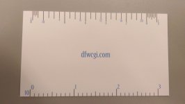
Could you put lines on the back for the notes? I've seen business cards in the past that did that and always thought it was cool. The company I work for is an engineering firm and they have a ruler on the back of the card.