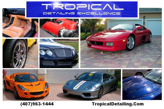
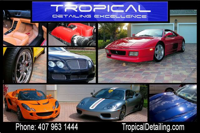
Rate my post cards

congrats on the contracts man glad to see someone "made it". 1 thing i learned from this profession is stick to your profession. ur cards look damn good but there r guys out there that do that for a living and there is a reason behind it. they know the key words, sizes, etc. try the guy from rightlook his name is jesse, he already does alot for porche, roles royce, bmw, lambo, in san diego, and hes not cheap but he knows his stuff. just another option and good luck with new job
 
I like the black background and other than the smaller fonts for # and website, I think the last black card you posted looks perfect... with the exception of the bentley... it looks random for some reason
 
I still think you should take something out (your choice) and insert in it's place a super shiny engine shot.
 
TH0001 said:
How is this...


01postcard3.jpg


I think this one looks great!


Talk to you soon.
 
TH0001 said:
How about the revised one (above) in black?


02postcard2.jpg

IMHO this black border postcard looks waaay better than the first one. I prefer the black border because white could get dirty and look nasty with handling (ever shopped for a greeting card? I bet you never take the one that's up front). One more minor thing - add www. to your web address and get rid of the upper case letters in it (yes, I'm very detail oriented [pun intended], but so are those high-end customers you're going after). Oh, I am sooo jealous! Always wanted to work on something other than the nasty daily drivers I get. Best of luck!
 
Back
Top