Bythehour said:
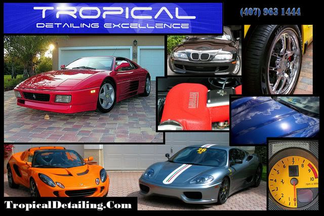
I love the Ferrari shot...particularly with the sun just peaking over the car from behind the house. Nice font on the banner as well.
If you are open to change:
1. The top right of the card is too busy. Too much going on? I don't understand the BMW pic (the other three seem to convey "attention to detail")
2. I don't understand the point of the tach in the lower right.
I am very open to change, that is why I posted this, thanks for your comments, I will draft a couple more and post here for your critiques.
Remove the BMW shot, you already have 3 front ends on your card, you don't need a 4th. You already have hood shots on your full car shots, so that one may not be necessary. I would use a larger engine shot and a wheel shot in place of the 4 picture setup in top right.
Something else I noticed, if you do not change the top right, you need to fix the border of the BMW shot and Ferrari Engine shot. The borders don't line up and it has a jagged look. Clean that up, and as is, it's not too bad, but many a little over the top with the number of pictures.
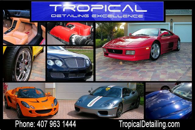
I will do something with the logo, but I hand drew it (took many hours) so it has to stay. Thanks for the comments, it looks like the Bimmer is gone. I really like that picture also, I want to have a black car I have done.
I would use a different photo to replace the BMW. Maybe a closeup of the back of the car or a shot of the grille. The center picture with the name 'Ferrari' I woulld turn around so it's readable. What's the purpose of the tachomter on the bottom right?
Overall I like the postcard. I really stands out.
Thanks for the idea on the Ferrari logo on the engine, I thought the tach would make it stand out, besides the yellow color of a Challange Stradale's tach kind of stands out.
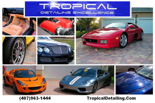
If it was me (I wish) - I would have Tropical Detailing Excellence across the top in white lettering against the black background (the blue seems to chop up the card) OR go with the blue all the way across the card. I would add a sedan (Maybachs, Bentleys, etc. are exotics aren't they?). Reduce the number of photos and have them all line up. Phone # and website across the bottom (also in white lettering) to match the top line OR create a second line for the top so all your info is in one place. The way it's set up now is too fragmented and your phone # is too hard to read. Just my .02.
I will change the phone number, thats a copy I had on from when I started designing my website. I have to keep the logo because I worked very hard on it, I don't want to loose it yet. The reason I don't have a sedan is because I have never worked on one. Those are all photo's of cars I have done so I have wanted to use my own work. I am doing a black Maserati Quattroporte this weekend, maybe I'll wait for that to be done. Maybe I'll pouch a photo off the internet, but I really wanted to keep this all my work. Thanks for the compliments.
"Congratulations on those contracts! I'm in the Orlando as well. Any chance they are looking for a second professional detailer to share the workload?"
Not at the moment, but my exotic car load is increasing dramatically, so I may need some one to help in the future.
Thanks guys, I will take some ideas into consideration and start comming up with more ideas. Thanks!!!!