Navigation
Install the app
How to install the app on iOS
Follow along with the video below to see how to install our site as a web app on your home screen.
Note: This feature may not be available in some browsers.
More options
Style variation
You are using an out of date browser. It may not display this or other websites correctly.
You should upgrade or use an alternative browser.
You should upgrade or use an alternative browser.
New Logo Opinion
- Thread starter Wraith
- Start date
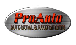
Really nice but the end of the word "reconditioning" gets a little washed out against the darker background. I realize that you're going for a reflective/shine look, just see how you like it if he lightens that area just a little. I'd also get rid of the white area in upper left, it looks as if it's incomplete and the border going from thin to thick (love it) should give you the effect you're looking for. Just my .02. Oh, and GOOD LUCK!!
imported_mirrorfinishman
New member
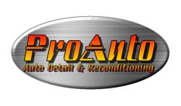
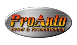
Since the business name is ProAuto, maybe the second line should just be "Detail & Reconditioning'.
Try these out, I like the first one, just changed the font on the tagline. Took mirrorfinishmans advice on logo two and changed the tagline. Am going to the printer next week and need to make a decision... Thanks for the input guys.
Attachments
imported_mirrorfinishman
New member
Okay, so as prospective clients begin to call you on the phone, which way would you answer their calls?
1- Hello, proauto auto detailing and reconditioning.
2- Hello, proauto detailing and reconditioning.
I think when you look at things in their simplest terms, such as the way you would speak the words that are displayed on your printed materials, you begin to get a better idea of the way someone else will read what you have printed. Personally, I have never thought it was a good idea to repeat the same word twice in a row in print. It's not a big deal, it is just personal preference.