new card... whatdya think??

speedingpenguin said:
Glad to hear!


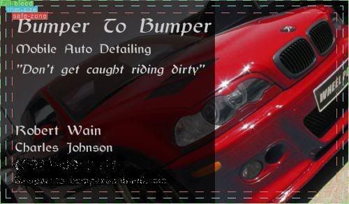
What if (now this again is just something I'm throwing out there for ya...) you were to make the background pics almost completly transparent, and lower the porsche's transperancy (or raise, however you wanna look at it) to where the background currently is? it'll be real light, but you'll still kinda be able to see the car in the wayyy background..... enough to fill in the space and people will still know its a car, and that way the porsche can stick out but not be overpowering....


I wish I had photoshop on this computer, I love this sorta stuff and I'd be more than happy to throw some of my own ideas up on here for ya....


Haha that's exactly what I said above...

lecchilo said:
Yea I actually wanted to Porsche to be somewhat transparent (more than it is currently) but less transparent than the background pics... I wanted to background pics to read clear enough but still provide a somewhat white background


Thanks again for the reply... I'll mess with it again when I have some time.
 
I use "Auto Reconditioning Specialist" though Auto Detailing Specialist works as well.

I think a lot of people tend to go overboard with images on their business cards.

Also, think of a clever and classy slogan to go along with the picture.


My cards are just a logo and contact information so I'd love to redesign my own.


edit: yeah, sorry. didn't finish reading the thread before i posted. i'm such a noob. :chuckle:
 
todd@bsaw said:
I prefer the term "Auto Detailing Specialist"

I use "Auto Reconditioning Specialist"


Do you use a phone number for your business or is the web page/email your only contact?

Also, think of a clever and classy slogan to go along with the picture.


My cards are just a logo and contact information so I'd love to redesign my own.


I do use a phone number, and have included both it and my email/website in the last few posts I made with the bus. card Thanks for the help
 
Ok... I have decided I'm going with the following design...


normal_front18.jpg


normal_front19.jpg


normal_front20.jpg


The following adjustments will be made:


The text will all remain where it is currently, with maybe minor adjusting (I will print out cards as I edit them to see what comes out best), and font will probably change but nothing drastic.

-Image will almost definitely change to either

1. a really nice reflection shot in which you can still see that it's a car (maybe a side door, or

2. hood/roof, something like that) or a nice beading panel on a car... I will take out any car make badging, etc..

3. me working on a nice car, probably polishing with a rotary (well acting haha)


I think it's simple enough yet has some attractive qualities... I might add some color but it's doubtful.


Comments...
 
speedingpenguin said:
awesome! can I see it?


It looks a lot like what you have currently with the fade to black. This is a draft of it(my scanner isn't working for some reason) I went darker on the black(then what is shown) but you can still see the car a little. I blacked out the # and website address cause some forums don't allow it. I went with glossy too and I like them.


card1.jpg
 
r_wain said:
It looks a lot like what you have currently with the fade to black. This is a draft of it(my scanner isn't working for some reason) I went darker on the black(then what is shown) but you can still see the car a little. I blacked out the # and website address cause some forums don't allow it. I went with glossy too and I like them.


card1.jpg


I like it... we're going to end up with very similar cards... I won't have the black on the left transparent at all though, and a different pic of course... but the text layout will be somewhat similar
 
Well, if ya did the second one (I like this one), you might save some money cause its black and white, no color....

On that same note, however, the red pops out nicely, so I'd be curious to see what the 2nd one looks like with some red text like you did in a few others...

I like how these are nice and simple, yet effective.

BTW I got the package yesterday. Thanks again for everything, and out of curiosity, where did you buy those brushes?

-Chris
 
optimusp517 said:
Having the red stand out is pretty nice. I like that one...


Red car, text or both?


speedingpenguin said:
Well, if ya did the second one (I like this one), you might save some money cause its black and white, no color....

On that same note, however, the red pops out nicely, so I'd be curious to see what the 2nd one looks like with some red text like you did in a few others...

I like how these are nice and simple, yet effective.

BTW I got the package yesterday. Thanks again for everything, and out of curiosity, where did you buy those brushes?

-Chris


I did the 2nd one with red text liek the others but I felt like everything should be black/white on that one.... the brushes... from the hospital... don't ask what they're used for (not because it's for something horrible, but because I don't know)
 
r_wain said:
So what did you choose?


haha nothing yet... I'll mess with it and print out until I really really like it... I'll keep posting as I edit the card... so far I like the red car I have above on the right... I'm mostly going to edit the text style, color, and position
 
Latest Update... Please make comments on everything.. text layout, photo, etc...

I want to finish up the card and want to look at any issues you guys come up with... So far I like the 1st, 2nd and 2nd to last most of all...can't really decide which image I like better


normal_front30.jpg


normal_front31.jpg


normal_front32.jpg


normal_front33.jpg


normal_front36.jpg


normal_front35.jpg
 
Back
Top