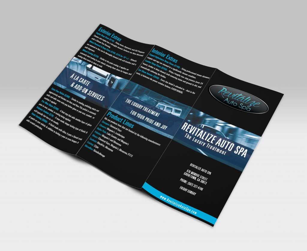
Love the design. The first change I would do is make the phone number font slightly larger. I know most of the font is the same size and aesthetically it looks fantastic, but I would want the phone number to be very easy to locate and there's plenty of space in that area.
I would also consider adding the phone number/website to the bottom of every page like you have on the front with the blue stripe. Consumers have a tendency to look towards the bottom of websites/ads for contact info. For example, if someone has a question on an "a la carte service", they glance at the bottom of the brochure and easily find your phone number.
Finally, I'd consider removing the "Friday-Sunday" on the front page. I think this is the most "controversial" of the changes and only you can decide whether to remove it or not. If I didn't know anything about you or detailing, I'd think the shop that works 5-7 days a week full time is better and has more experience than the shop that only works on the weekends. It will also make them call you to check for scheduling/availability, which is the ultimate goal for your brochure. If someone wants a detail on Wednesday, but see you're only available Friday-Sunday maybe they won't even bother calling you. Whereas if they call you to check for availability on Wednesday, that gives you an opportunity to talk them into Friday-Sunday. Sometimes less information is more.
But the brochure looks great so far.
Edit: I photoshopped a quick outline of everything I mentioned above. Please excuse the imperfections and wrong font, I did this quickly to give you a visual.