Navigation
Install the app
How to install the app on iOS
Follow along with the video below to see how to install our site as a web app on your home screen.
Note: This feature may not be available in some browsers.
More options
Style variation
You are using an out of date browser. It may not display this or other websites correctly.
You should upgrade or use an alternative browser.
You should upgrade or use an alternative browser.
Logo Design Help Needed (Paypal Reward)
- Thread starter Labster
- Start date

flamewerks
New member
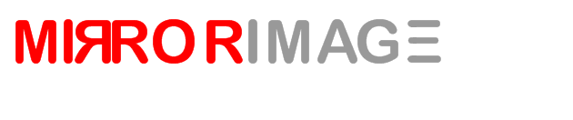
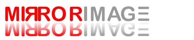
The top one is similar to mine.
try posting on www.ifreelance.com...they have some good freelance graphic designers on there. They bid to get your work.... check it out.
flamewerks
New member
dheath said:I like the reflection but I think your reflection is backwards...
Wouldn't it get light the further away from the text? Or are you doing that to separate the words and make them easier to read?
I think it's the right way, no? Otherwise it would be the same word twice. One underneath the other, this way it looks like the word is sitting on top of a mirror.
Darkstar752
New member
I have the perfect design for ya in my head buddy, I wish I could help you out but I have no way of designing it.
flamewerks said:I think it's the right way, no? Otherwise it would be the same word twice. One underneath the other, this way it looks like the word is sitting on top of a mirror.
a reflection fades as it gets farther away though?
I guess it works both ways... probably easier to read it the way you have it posted.