Navigation
Install the app
How to install the app on iOS
Follow along with the video below to see how to install our site as a web app on your home screen.
Note: This feature may not be available in some browsers.
More options
Style variation
You are using an out of date browser. It may not display this or other websites correctly.
You should upgrade or use an alternative browser.
You should upgrade or use an alternative browser.
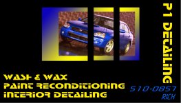
Evaluate This Business Card Please
- Thread starter CARTfan
- Start date
CalgaryDetail
Mike
i like the general layout but personaly i think the lettering is to hard o read quickly. and people are goign to glance qucikly and thast what you want. Also i would stick with the picture being whole im peersonaly noy a fan of the split up. looks to artistic for the card. Thats just my opion and im sorry if i offended neone but those are my thoughts
http://www.detailcity.org/forums/images/attach/jpeg.gif
jpeg.gif
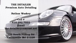
here's mine
i personally like a simple clean card
jpeg.gif
here's mine
i personally like a simple clean card
Attachments
C. Charles Hahn
CCH Auto Appearance, LLC
CalgaryDetail said:i like the general layout but personaly i think the lettering is to hard o read quickly. and people are goign to glance qucikly and thast what you want. Also i would stick with the picture being whole im peersonaly noy a fan of the split up. looks to artistic for the card. Thats just my opion and im sorry if i offended neone but those are my thoughts
I agree. Overall the card is good, but those fonts have got to go, IMO. :boot
Beemerboy
Just One More Coat
My thoughts are that you have to many things listed on the card.
Auto Detailing covers it all....anyone that is interested in getting their car done will understand the wash / wax, paint reconditioning and interior cleaned parts of the service
For me I wanted to keep the lettering simple and not list the services out...that's my view on it...Here is mine that I made on line at prints made easy
Beemerboy
Just One More Coat
BLACKWRX said:nice card beemerboy.......simple,clean, easy to read......i like it
That's what I was looking for the real selling of my services is done in person
CARTfan
New member
Thanks for the feedback guys. Beemerboy, you bring up good points. As everyone said, the font isn't the easiest to read, but I liked the edgy look so that's why I picked it. Definitely won't use it though. Oh, and thanks for posting your own personal examples. I appreciate everyone's candidness.")
Beemerboy
Just One More Coat
CARTfan said:Thanks for the feedback guys. Beemerboy, you bring up good points. As everyone said, the font isn't the easiest to read, but I liked the edgy look so that's why I picked it. Definitely won't use it though. Oh, and thanks for posting your own personal examples. I appreciate everyone's candidness.
I don't think the font is that hard to read its just a bit overwhelming....what I would do is take out the wash / wax letting on that side of the card....and insert your name and phone number (personal data) use the same font and color....this to me will balance the card