critique my website

Brian_Brice

New member
still working on it, i made it today and could use some help. its under my profile. i can't get my letter head on there because its a adobe file, ive been fighting with it all day and can't seem to get it into proper format.
 
The Merc on the home page looks bad since the proportion is all wacky. Of course the car looks great when you open up to the full picture.

Same applies to some of the pictures on your services offered page. You want to advertise your work but it’s hard to look at since the cars are distorted. I think for that reason you are selling yourself short.


The 10% off offer near the bottom looks strange. Almost like it was just thrown in as an afterthought.


I’m certainly not a grammar pro but I am pretty sure you should insert a comma after vinyl before the and in the second line of Why detail your car.


Keep working at it and you'll have some great advertisement. :bigups
 
lmao, that ten percent thing was an afterthought to attract attention, i look at it right now as rough draft, i dont know how to get my pics in full scale on the amount of space i have to deal with so it's a crap shoot. one problem i plan on eliminating is lack of pics, i rarely take pics of my work and need to start. i gotta figure out the thumbnails.
 
VaSuperShine said:
lmao, that ten percent thing was an afterthought to attract attention, i look at it right now as rough draft, i dont know how to get my pics in full scale on the amount of space i have to deal with so it's a crap shoot. one problem i plan on eliminating is lack of pics, i rarely take pics of my work and need to start. i gotta figure out the thumbnails.

Haha well sometimes things resemble what they are ;) Figure out the thumbnails and I am fairly certain the picture proportion issue will be resolved.


"A rough draft"... you have to start somewhere. It can only get better from here. :dance
 
VaSuperShine said:
ok twitch i modified a few things take a look.
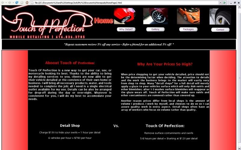
Whoa now the picture on the home page is fairly large. IMO now that I look at it, it's not the most flattering picture to have on the home page.


Sorry Brian I really don't mean to slam your work as that is not my intention at all. Just pointing out how it looks... to me.


I do commend you for tackling this on your own. Building a nice professional site is not easy at all. I turn to my brother for his expertise in that arena.
 
Hey Brian,


I copied your code into Dreamweaver and tomorrow while at work Im going to play around with it a bit. No big changes but see if I can get that picture in there for you. If you decide you dont want that one just shoot me the picture you want in place of it. Not looking for you to use my code or anything just feel like playing around with it, I like the look of what you have going on so far.


I would also like to commend you for tackling this yourself. It will bring you alot of satisfaction when completed. I have my website complete, just need to get the courage to upload it to the website I have parked. Here is a screenshot of my homepage...needs some updating but you get the idea:

Image2-1.jpg
 
twitch said:
Whoa now the picture on the home page is fairly large. IMO now that I look at it, it's not the most flattering picture to have on the home page.


Sorry Brian I really don't mean to slam your work as that is not my intention at all. Just pointing out how it looks... to me.


I do commend you for tackling this on your own. Building a nice professional site is not easy at all. I turn to my brother for his expertise in that arena.

well i appreciate your opinions
 
Hey VA, I think Twitch just meant like the backdrop of the picture isn't the best maybe? Like if you could get a better background to take the pictures. Trust me I know it isnt easy, all my backgrounds suck lol so I just blur them out. But by no means was twitch trying to knock the detail because it looks great :hifive:
 
Joshua312 said:
Hey VA, I think Twitch just meant like the backdrop of the picture isn't the best maybe? Like if you could get a better background to take the pictures. Trust me I know it isnt easy, all my background suck lol so I just blue them out. But by no means was twitch trying to knock the detail because it looks great :hifive:

Thanks Josh. That is exactly correct. I am not the type of guy to “dis� on anyone’s work. For the website I was providing some constructive criticism.


I am not disrespecting your detailing work at all Brian. Actually my intention was the opposite. What I am saying is that I know your work is better than what that particular image suggests. A full shot in the sun would show your detailing talent off more than particular picture does.


Sorry for the miscommunication :cool:
 
no biggie, i just took it the wrong way, i know its not very glamorous to have a stoop in the background with my grill, i tried to erase all the background but just made it look worse. i do need the help and criticism so please don't let me stop you. It's very hard to have a complete sun shot show up on this color. even when i took befores you could barely see any marring. you could see it in person however under the right light. it's actually hard to even look at it in direct sunlight which is why there is no full sun shot. im going to touch that car up today maybe i can get a better backdrop. believe me i'd much rather be working out of some of you guys clients hangars as opposed to polishing under an ugly tree, i just don't have it like that. ive got a few black vehicles this week after the monster 38 footer. we will see what i can come up with.


also, how do i convert my letterhead from adobe, it seems ive tried everything, i'd like my logo on my site. i guess i have to print scan then attach but my printers on the fritz(out of ink) and i dont have a scanner.
 
Brian, what are you trying to convert? If you simply want a logo that you have on your computer and cannot format it into the correct file type you could always do a screen snapshot and then just select the image you want to copy.
 
It's wierd. I spent half an hour putting together a "critique" and when I went to Post it, the site gave me an error. When I tried to find your post again, it wasn't on the list. Since then other people have posted some of the same comments, so here is my shortened list of comments:


- I mentioned this in someone else's request for critique...Use a font that does not have serifs. If the webpage does not explicitly have a font, the default font is used and that one has serifs.

- Make sure your whole site has a consistent look and feel. That means the fonts, color scheme, overall scheme. As I navigate from one page to another, the fonts change, the backgrounds change. It makes it look like different people worked on different pages without talking to each other and then put them together at the last minute.

- Come up with a top banner that will be present in all your pages and make sure your company's name is there all the time. If I click on the services page, it just says "services." Whose services? You can use Autopia as an example. That Autopia banner stays there no matter where you go.

- Also, make sure your page title has your name in it. You can still include the specific page title as well. For example "Superior Auto Detailing - Home" and "Superior Auto Detailing - Services." This helps if I go do something else on the computer and when I try to find the browser that has your site up in my taskbar, I just don't see "Home."

- As other people mentioned, work on making those pictures not stretch out. And get a spectacular picture for your home page. This the first thing people see and first impressions go a long way.

- Use Bold fonts sparingly. Bold is used to emphasize something and if it's used all the time, you lose that effect.

- Don't use that tile background like in your services page. Maybe it's just me, but I don't like it.


Please don't take these things personally. I know you spent a lot of time already on your design, and it's a good start. Getting the design right is like detailing a car. There are many steps to perfection and it takes time. I'm not a professional website designer, but I've built many in my job, and a lot of time is spent moving this table over 1 pixel to the right and pushing that picture 2 pixels to the left to make sure things all line up.


Bear in mind that this website is representing you and you can't be there to speak for yourself. If a potential customer clicks on it, he needs to be WOW'd if you want him to be interested.


Good Luck and Have fun!
 
thanks guys, i didnt figure it would be as hard, i agree with everything said and will continue to work on it. i know this isnt the attitude to have but it's not like the right people will be viewing it anyhow, i live in a pretty small area, most my high priced clientel i have to drive a few hours for. i dont like driving a few hours.
 
well ive got my logo on but i don't really like the way it looks. theres a lot of work involved here.


I think thats about all im going to do to it, i have a friend who does this for a living (who doesn't) im sure when i give him the reigns it will look much different.
 
Back
Top