thesacrifice
New member
I'm going to sound mean but...
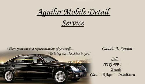
You need to work on a uniform text justification. Just throwing text all over the place does not work.
You need typography that compliments each other, using a bunch of different fonts does not work.
You've got photography and then a kiddy looking illustration
All of your cards have been to busy. You want someone to see what your car is about in 1-3 seconds. That last one, I see a browned out car, a browned out landscape and then a jumble of text.
business cars are meant to be SIMPLE
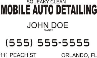
While I'm not fond of the font on the card Joshua made, look how its simple and flows. On his card I'd bump up the size of the logo or company name and bring it away from the top a little bit, put your contact info in a non serif'd font and bump it down a line or two away from your slogan.
You need to work on a uniform text justification. Just throwing text all over the place does not work.
You need typography that compliments each other, using a bunch of different fonts does not work.
You've got photography and then a kiddy looking illustration
All of your cards have been to busy. You want someone to see what your car is about in 1-3 seconds. That last one, I see a browned out car, a browned out landscape and then a jumble of text.
business cars are meant to be SIMPLE
While I'm not fond of the font on the card Joshua made, look how its simple and flows. On his card I'd bump up the size of the logo or company name and bring it away from the top a little bit, put your contact info in a non serif'd font and bump it down a line or two away from your slogan.