Another critique my bus. card thread

clnfrk

New member
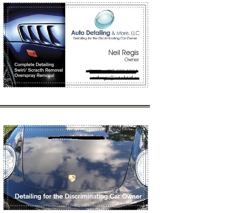
Here is the first draft of my new business card. Let me know what you guys think and if you have any suggestions to improve it, please let it be known. I am already aware that the word "scratch" is spelled wrong, so that will be taken cared of. All comments and suggestions appreciated.


DetailBusinessCard.jpg
 
cj99si said:
The only thing I can think of is that the pic doesnt tell enough of a story.


Which pic are you referring to and do you have any ideas for a replacement pic? How much of a story do I need to tell for a detailing business card? I know alot of people might not even know exactly what detailing means, but those aren't really the target customers that I am seeking anyways. I want my potential customers to have some general idea of what is involved with the detailing process and not just see me as a car washer.


That is why my entire business image will be devoid of any cheesy images or lines that may serve to portray anything less than top notch detailing services, which I take great pride in providing to my customers. I want my customers to use my services for the quality of work that I provide and the level of professionalism displayed, as opposed to the price shoppers who's main concern is finding the best price out there.
 
Im probably over thinking this but the fins are pretty exclusive to BMW. It probably doesnt matter unless all merc owners hate BMW's:nervous: maybe a pic with some more reflections that says expensive car but not witch brand? Maybe even carry more of the pic you choose into your white part but have that part pretty ghosted(80 or 90%).... Like I said im probably over thinking it, It looks good.
 
I like the card.


Business Cards serve a single, simple purpose. It conveys information and image. Your sample does not attempt to do all of your marketing, and that is good.


Yes, it needs your name and title, but what title? CEO, President, etc. are all a little overkill, given the nature of our work. I feel that 'owner' is somewhat crass, or at least, lacking style.


I use the term 'Principle'. :chuckle: Whatever...


In a previous (nightclub) environment, I was a 'Managing Partner'.


Food for thought.


JB
 
The white writing gets a little washed out by the clouds in the pic. Try gray or silver or any light blue or shade of purple - whatever floats your boat. "Detailing for etc." is not centered on the pic. You might even try a different logo - I just don't get it. Just my opinion, food for thought.
 
I think it looks great. Its very simple and professional.


Personally, I would change the slogan from "Detailing for the Discriminating Car Owner" to simply "Detailing for the Discriminating Owner," because it seems a bit redundant.
 
Back
Top