Jean-Claude
Keeper of the beautiful
Show 'em off fellas.
Follow along with the video below to see how to install our site as a web app on your home screen.
Note: This feature may not be available in some browsers.


Jean-Claude said:ok...
Ignore the fuzz from my carpet that somehow got on there and the slightly out of focus image part.


lecchilo said:Here's mine... I first printed the same design but glossy, figured I'd try matte, and liked matte better...
Front:
Back:
Irkie500 said:Here is mine, Still is a work in progress so tell me what you think!
For some reason its a bit pixilated here on the site making it a bit hard to read but on the computer its much better.

Irkie500 said:Thanks for input, like I said still a work in progress, I need to play with the font for the personal information, I didnt realize how small it was until I posted it here.
Here how is this? Changed the text and made it much larger.

Jean-Claude said:I like it. Very elegant.
Leadfootluke said:wow I love your card Ivan. Very clean.
Jean-Claude, simple and effective as well. Very nice guys.

lecchilo said:Thanks!
(I hate this 10 character limit because I can't simply type thanks, but have to type thanks and then also how I have the 10 character limit)

Superior__Shine said:I thought we can't post contact info on here?
If I am incorrect I would gladly add the other side of my card to the post.
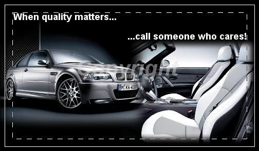
The pic on my card is from the Lamborghini press release event we detailed for awhile ago - Lamborghini Event

