My new business cards....

Lotuseffect

New member
Inspired in no small part by Charlie Hahns.
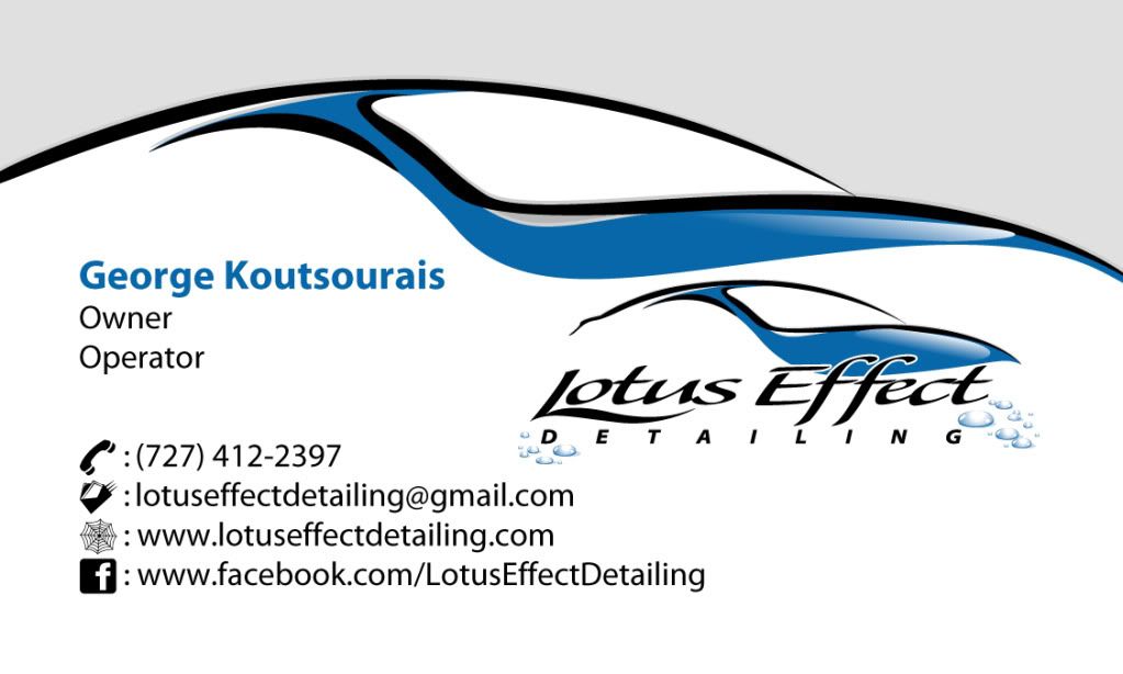


Front side


LotusEffectDeD13mR01aP03bZL-Buren1a.jpg


Back side


LotusEffectDeD13mR01aP03bZL-Buren1a_Back.jpg


I completely ripped off Charlies "Cosmetic Enhancement". I just loved that phrase, it perfectly encapsulated the point I wanted to make rather than "Paint polishing" or "Buffing".


My wifes been handing them out at my kids school like they are candy. I already had to give away one free detail this year for a school fundraiser...those kids never stop costing me sweat and money.
 
I like it for the following reasons.

1. You didn't put a picture of some exotic car on it which the average paying customer can not relate to.

2. You provided excellent contact information.

3. You state what your services offer.

4. It is not "intiminating" to those who read the card.

Grumpy
 
George, those look killer! And they say imitation is the sincerest form of flattery... thanks for the compliment!


I don't know how many of them you bought, but I would say two small things for the next round:


1) I kinda like the revision Dan made, the outline of the car in your logo being on the card twice does actually seem a little redundant. It's nothing horrible though.


2) Not sure I like that the front of the card is in landscape orientation, and the back is portrait. Personally I think you could still make it work on the back with the layout in landscape, even though your QR code would have to be slightly smaller.
 
Nice card setup. I like the revisions D&D made too. Are you by chance a graphic designer? I am in the market... :P
 
I like it for the following reasons.

1. You didn't put a picture of some exotic car on it which the average paying customer can not relate to.

2. You provided excellent contact information.

3. You state what your services offer.

4. It is not "intiminating" to those who read the card.

Grumpy


Thanks Ron. I really liked the outline of the car as well. I agree with you about the exotic car on the card. I know some have it, and I think its fine too, however I do far more Hondas, Acuras, Lexus, and Nissans than I do exotics.


C. Charles Hahn said:
George, those look killer! And they say imitation is the sincerest form of flattery... thanks for the compliment!


I don't know how many of them you bought, but I would say two small things for the next round:


1) I kinda like the revision Dan made, the outline of the car in your logo being on the card twice does actually seem a little redundant. It's nothing horrible though.


2) Not sure I like that the front of the card is in landscape orientation, and the back is portrait. Personally I think you could still make it work on the back with the layout in landscape, even though your QR code would have to be slightly smaller.


Yeah, Dans looks killer! I already saved a picture of it to my desktop for the future cards lol. I really wanted to either both sides in landscape or vertical but the printer couldnt assure me the code would come through minimized any more. I was definitely trying to flatter you. Your card is very well done and it definitely made me completely throw away all the ideas I had for my card.


where do you get the little square thingy on the back? what is that called anyway?


The link Charlie gave you is a great site. You just type in all the info you would like to be present and it generates the code. It is specifically for people with smart phones with the free QR reader app. Just great technology and great marketing (also thanks to Charlie)


i like it , that car needs some wheels, yeah that`s what`s missing


HA Cosmin. Thanks for the compliment.
 
Lotuseffect said:
Yeah, Dans looks killer! I already saved a picture of it to my desktop for the future cards lol. I really wanted to either both sides in landscape or vertical but the printer couldnt assure me the code would come through minimized any more. I was definitely trying to flatter you. Your card is very well done and it definitely made me completely throw away all the ideas I had for my card.


Hmm... how big is the code on your actual card (compared to mine)? I do know that shrinking the code makes the "read success" rate go down a bit but I'm kind of surprised it would have to be decreased in size enough for that to be an issue.


But, I'm not a printer so maybe they know something I don't. It still looks awesome, either way!
 
If I may make another suggestion for future runs, if I were you I'd change the "owner operator" phrase to just "owner." Had an english professor rip on that one time during a class and haven't been able to think about it the same way ever since. Basically, he was saying that by putting owner and operator on a card you're being redundant. You're the owner, so you obviously operate the business, or so my professor said.


Other than that, though, it looks good. I'm going to have to look into QR codes now, but I don't know if I have many clients who are high tech enough to know what it is :P
 
dfazekas said:
Other than that, though, it looks good. I'm going to have to look into QR codes now, but I don't know if I have many clients who are high tech enough to know what it is :P


None of our clients have smartphones? I sometimes even ask people if they do and explain what QR codes are if they're not familiar.


It's been proven in marketing studies that on average, most people lose a business card within a week of receiving it. By getting them to instantly put you into their phone you're practically guaranteeing they will still know how to find you past that one week period and, since they don't have to even dial your number, it makes it very easy for them to give you a call from their contact list.
 
dfazekas said:
You're the owner, so you obviously operate the business, or so my professor said.

Not true if you have staff and a general manager. Depends on how you define the word "operate" I suppose.


Anyways, in my opinion, the logo is GREAT, and I very much like the landscape front and portrait back. I think that gives the card uniqueness.
 
Good looking card. I agree on downsizing the QR code but either way great job! Have you considered doing card designs for people here on Autopia for side income? If so, I need a basic card done for myself since I am almost out of my old cards and need a new design done and do not have the time anymore to do it myself.
 
Back
Top