Navigation
Install the app
How to install the app on iOS
Follow along with the video below to see how to install our site as a web app on your home screen.
Note: This feature may not be available in some browsers.
More options
Style variation
You are using an out of date browser. It may not display this or other websites correctly.
You should upgrade or use an alternative browser.
You should upgrade or use an alternative browser.
Feedback wanted on New Logo...
- Thread starter MusicMan
- Start date
Thomas Dekany
New member
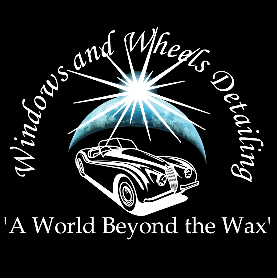
Looks cool to me - is that the name of your company? I am not sure if I like it. What is that mean? Windows and wheels?
Brad B
New member
Here is some brutal critique. ") I am in marketing and have a graphics background. I help companies with their brand and promo all the time.
I am in marketing and have a graphics background. I help companies with their brand and promo all the time.
-The name of the company is hard to read. Not the best choice of font and it needs letter-spacing done.
-The 'world' graphic with the starburst over it is hard to 'read' and make sense of. Gimmicky.
-The tag line should have less emphasis than the name. It competes. The name of the company gets lost.
-The Jaguar clip-art and the world/starburst art don't work well together. Too much going on in differing graphic styles that do not work well together. It looks too 'clip-art' like all around.
-You should design a logo that works in black and white only to start. If the 'world' gets printed in black it will look bad/weak.
-Are you always going to reverse out the text from a black square? Keep in mind the many ways it will be used and how large and small it will be reproduced. A good logo is very adaptable and readable every way it's used.
Sorry, but I don't think it looks terribly professional. And it's really important that it does. I would work to simplify it a bit. You are taking two thoughts and literally trying to reference them graphically in a logo. (Cars and World) and that is tough. Also the company name has Windows in it which further confuses things. Prioritize and simplify your message.
People need to know what you do and remember your name in about 2 seconds glance.
Sorry to be harsh. But that's the way good designs evolve. Keep at it!
I am in marketing and have a graphics background. I help companies with their brand and promo all the time. -The name of the company is hard to read. Not the best choice of font and it needs letter-spacing done.
-The 'world' graphic with the starburst over it is hard to 'read' and make sense of. Gimmicky.
-The tag line should have less emphasis than the name. It competes. The name of the company gets lost.
-The Jaguar clip-art and the world/starburst art don't work well together. Too much going on in differing graphic styles that do not work well together. It looks too 'clip-art' like all around.
-You should design a logo that works in black and white only to start. If the 'world' gets printed in black it will look bad/weak.
-Are you always going to reverse out the text from a black square? Keep in mind the many ways it will be used and how large and small it will be reproduced. A good logo is very adaptable and readable every way it's used.
Sorry, but I don't think it looks terribly professional. And it's really important that it does. I would work to simplify it a bit. You are taking two thoughts and literally trying to reference them graphically in a logo. (Cars and World) and that is tough. Also the company name has Windows in it which further confuses things. Prioritize and simplify your message.
People need to know what you do and remember your name in about 2 seconds glance.
Sorry to be harsh. But that's the way good designs evolve. Keep at it!
Ben@3D
New member
So by having a globe, does that mean you have world wide service?
Do you specialize in classic cars?
Can you help me get my windows tinted?
Just a few questions you might get with the current design you made.
A modern day car or graphic geared towards detailing may be a good idea. Just a quick web search and found these.


Not saying to use these graphics, but a logo like these can speak volumes about what you do.
Each of these logos at quick glance look professional and relate to what they are doing.
Just my honest 2 cents.
Do you specialize in classic cars?
Can you help me get my windows tinted?
Just a few questions you might get with the current design you made.
A modern day car or graphic geared towards detailing may be a good idea. Just a quick web search and found these.
Not saying to use these graphics, but a logo like these can speak volumes about what you do.
Each of these logos at quick glance look professional and relate to what they are doing.
Just my honest 2 cents.
C. Charles Hahn
CCH Auto Appearance, LLC
Brad B. said:Here is some brutal critique.
-The name of the company is hard to read. Not the best choice of font and it needs letter-spacing done.
-The 'world' graphic with the starburst over it is hard to 'read' and make sense of. Gimmicky.
-The tag line should have less emphasis than the name. It competes. The name of the company gets lost.
-The Jaguar clip-art and the world/starburst art don't work well together. Too much going on in differing graphic styles that do not work well together. It looks too 'clip-art' like all around.
-You should design a logo that works in black and white only to start. If the 'world' gets printed in black it will look bad/weak.
-Are you always going to reverse out the text from a black square? Keep in mind the many ways it will be used and how large and small it will be reproduced. A good logo is very adaptable and readable every way it's used.
Sorry, but I don't think it looks terribly professional. And it's really important that it does. I would work to simplify it a bit. You are taking two thoughts and literally trying to reference them graphically in a logo. (Cars and World) and that is tough. Also the company name has Windows in it which further confuses things. Prioritize and simplify your message.
People need to know what you do and remember your name in about 2 seconds glance.
Sorry to be harsh. But that's the way good designs evolve. Keep at it!
:werd: The man knows of what he speaks!
With my logo, it was specifically set up to be scalable, look good in either color or black and white, and for that matter I even have versions with and without the "car" graphic in it for times when I need to save space but remain uniform in overall appearance. That kind of simplicity is what you should really be looking for, not something that throws a bunch of elements together that aren't a good fit.
Tru_Shine
New member
agreed with the above.
good luck with getting all of that embroidered onto a shirt.
Keep it simple and to the point.
Also, you dont have to have a "Quote" in your logo
good luck with getting all of that embroidered onto a shirt.
Keep it simple and to the point.
Also, you dont have to have a "Quote" in your logo
justin30513
Mobile Detailing Services
I had the same critique that Brad B. just gave. I took it and after many tries, came up with my logo.......
I appreciate everyone's feedback. I know my logo won't please everyone, ive accepted that lol...but i do understand what you guys are saying. I dont want to totally drop what i've come up with, but I do plan to make a few alterations.
I'm not afraid to have something different than what is common. I see almost everyone with the straight line drawing and its nice but i wanted to jazz mine up a little bit. C. Charles i really like your logo, it turned out very nice.
Brad i appreciate your points. My name im not changing, i can tell you that much...ive had it for a few years now and its become fairly well known around here...i understand how it may confuse the point some but 'detailing' or 'mobile detailing' put right there with it should drive home what i do. The main thing i want this logo to be on is t-shirts and my trailer once i get it.
I am taking your advice on changing the top lettering, or at least going to look at it to see if i like it better, i think the 180 degree circumference does make the company name difficult to read at a glance...so i'll either have it done in straight horizontal line(s) or in a broader arch to where you dont have to twist your head to read it lol. I'll also downsize the slogan so that it isn't getting as much attention as the company name...i agree w/that point too.
Once i get the next updated image i'll post for further criticism lol. But i dont mind it and appreciate you guys taking the time to comment.