

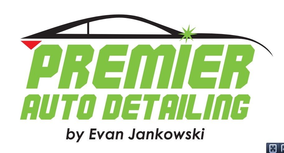
Hey guys currently on vacation but got my first look at my new logo. Please tell me what you think about and and let me know! Thank you in advance!
Results 1 to 15 of 34
Thread: Logo design thoughts and input
-
08-05-2013, 11:45 AM #1I'm addicted to Shine


- Join Date
- Apr 2013
- Location
- Pittsburgh
- Posts
- 724
- Post Thanks / Like

Logo design thoughts and input
Official Selected Team Member of the Air Force One Detailing Team
Flex 3401 / Flex PE-8 / Rupes 21 / G110v2 / GG6" / Rupes 75E / GG3"
Click and Like my Facebook Page
-
08-05-2013, 12:28 PM #2
- Join Date
- May 2013
- Posts
- 79
- Post Thanks / Like
Re: Logo design thoughts and input
Needs phone number/website and location. Not crazy about the green color. Nice start though!
-
08-05-2013, 06:06 PM #3


- Join Date
- May 2013
- Posts
- 2,013
- Post Thanks / Like
+1 on the green. It`s a little bit much. I know you are looking for something that is eye catching, but try to keep it between red or yellow. It is proven in marketing studies that those two colors are the most noticeable (McDonald`s ring a bell?). Also, I think if the lettering was a little smaller it would help the "balance" between the car and the lettering. Originally Posted by Mavin
 2006 Saleen S281 Supercharged - Black
-
08-06-2013, 11:19 AM #4I'm addicted to Shine
- Join Date
- Apr 2013
- Location
- Pittsburgh
- Posts
- 724
- Post Thanks / Like
Re: Logo design thoughts and input
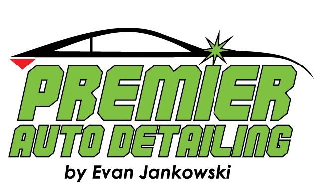
Thank you both for the in put I have made a request to tone down the color here is an update
 Official Selected Team Member of the Air Force One Detailing Team
Flex 3401 / Flex PE-8 / Rupes 21 / G110v2 / GG6" / Rupes 75E / GG3"
Click and Like my Facebook Page
-
08-06-2013, 11:38 AM #5
- Join Date
- May 2013
- Posts
- 79
- Post Thanks / Like
Re: Logo design thoughts and input
Better! I would just go away from the slime/puke green though.
Why not ask him to make it up in a bunch of different colors for you. It will take 5 minutes and you will have a ton of options.
-
08-06-2013, 04:04 PM #6

- Join Date
- May 2013
- Location
- Long Island, NY
- Posts
- 136
- Post Thanks / Like
Re: Logo design thoughts and input
Honestly I`d skip the silhouette of the car it`s been done to death here`s a google search for "car detailing logo".
look at all that "originality"...
https://www.google.com/search?safe=o...&tbm=isch&um=1
I`d be willing to bet a large number of the detailers who post on this site have something similar too not knowing how common it is. Heck the first detailing logo I did for someone about 8 years ago had one too haha.
The color doesn`t bother me as it does some others, might not be my first choice but the font itself doesn`t say high end car detailing to me and that`s more off putting than lime green.
-
08-06-2013, 05:22 PM #7Detailing Gnosis

- Join Date
- Jul 2007
- Location
- Hillsborough, NC
- Posts
- 8,305
- Post Thanks / Like
Re: Logo design thoughts and input
Evan`s logo was in the list already! Originally Posted by XSSIVE
Al
The Need to Bead
-
08-06-2013, 05:56 PM #8I'm addicted to Shine
- Join Date
- Apr 2013
- Location
- Pittsburgh
- Posts
- 724
- Post Thanks / Like
Re: Logo design thoughts and input
Believe me I know the logo has been done as you can see from the searches but I have racked my brain trying to think of something different but I really can`t. From everything that I have found no one around here where I am located has nothing like it.
Official Selected Team Member of the Air Force One Detailing Team
Flex 3401 / Flex PE-8 / Rupes 21 / G110v2 / GG6" / Rupes 75E / GG3"
Click and Like my Facebook Page
-
08-06-2013, 06:03 PM #9Wax Waster

- Join Date
- Mar 2008
- Location
- SwFL
- Posts
- 27,090
- Post Thanks / Like
Re: Logo design thoughts and input
Phone
Web siteFormerly the "Best Detailer", now just Super Wax Waster Man. Not necessarily tactful, but normally right. It`s good to be da King !!!
-
08-06-2013, 06:21 PM #10I'm addicted to Shine
- Join Date
- Apr 2013
- Location
- Pittsburgh
- Posts
- 724
- Post Thanks / Like
Re: Logo design thoughts and input
Right now Ron I am just working with the main part of the logo to get that down and of course the website and phone number will be added Originally Posted by Ronkh
 Official Selected Team Member of the Air Force One Detailing Team
Flex 3401 / Flex PE-8 / Rupes 21 / G110v2 / GG6" / Rupes 75E / GG3"
Click and Like my Facebook Page
-
08-06-2013, 06:48 PM #11
- Join Date
- Sep 2012
- Posts
- 28
- Post Thanks / Like
Re: Logo design thoughts and input
I have two thoughts... they both deal with making the WORDS give the impression of "depth" which is what you are trying to promote by Detailing... So...
1) What about a drop down shadow on either one or all three central words?
2) What about color progression with the Green text. Meaning start with deep Green at either the top or bottom and fade to a lighter Green?
-
08-06-2013, 07:52 PM #12

- Join Date
- Sep 2003
- Location
- Cleveland, oHIo
- Posts
- 2,494
- Post Thanks / Like
Re: Logo design thoughts and input
I would drop the by Evan Jankowski part. You want brand recognition and not tying it to your name. That way if you ever wanted to sell the business or something like that you have a brand to sell not tied to you. I also would not go green at all. Blue, red, red with a yellow drop shadow might be nice.
You have activated my special ability....
-
08-06-2013, 10:55 PM #13

- Join Date
- Aug 2011
- Posts
- 422
- Post Thanks / Like
Re: Logo design thoughts and input
I agree that the car silhouette should be canned. It has been so beaten to death in this industry (and others for that matter). I`d rather have no logo than one with a car outline..but that is just me.
-
08-07-2013, 05:45 AM #14Detailing Gnosis
- Join Date
- Jul 2007
- Location
- Hillsborough, NC
- Posts
- 8,305
- Post Thanks / Like
Re: Logo design thoughts and input
I do not think anything is wrong with the silhouette but if I would change anything it would be the text color (green). If you really want green, use a darker shade.
Al
The Need to Bead
-
08-07-2013, 06:47 AM #15

- Join Date
- Jul 2013
- Location
- Staten Island, NY
- Posts
- 477
- Post Thanks / Like
Re: Logo design thoughts and input
Think I would change to the following:
Background Black
Car and Lettering Red
Star and Triangle Silver
Lettering outlined in silver

 Reply With Quote
Thread Information
Users Browsing this Thread
There are currently 1 users browsing this thread. (0 members and 1 guests)
Similar Threads
-
Logo design
By rimtp07 in forum Start your own auto detailing businessReplies: 5Last Post: 03-29-2012, 05:54 PM -
Logo Design?
By cjf_351 in forum Detailing Business Management & MarketingReplies: 7Last Post: 03-22-2010, 03:54 PM -
Logo Design Help
By Labster in forum Detailing Business Management & MarketingReplies: 7Last Post: 04-08-2009, 03:16 PM -
logo design?
By shadybreal in forum Auto Detailing 101Replies: 6Last Post: 11-01-2006, 02:22 PM -
Please help me design a new logo.
By GregCavi in forum Hot TubReplies: 1Last Post: 03-05-2006, 06:08 PM
Bookmarks