

Originally Posted by Accumulator
Exactly, I was thinking that the crest/coat of arms would do that. I guess it`s back to the drawing board.
Results 16 to 30 of 31
Thread: Feedback on this logo please
-
10-31-2006, 01:36 PM #16GOT PREP?


- Join Date
- Feb 2003
- Location
- memphis, 10
- Posts
- 3,698
- Post Thanks / Like

Word of Mouth Detailing
A man with experience is not at the mercy of a man with an opinion
-
10-31-2006, 01:49 PM #17

- Join Date
- Sep 2002
- Location
- NE Ohio
- Posts
- 86,984
- Post Thanks / Like
Originally Posted by ebpcivicsi
Heh heh, well, I don`t envy you this job...it might be tricky to come up with the right thing, but it could sure pay off if you nail it just right
-
10-31-2006, 02:01 PM #18
- Join Date
- Jan 2006
- Posts
- 279
- Post Thanks / Like
If you are looking for just an image and not necessarily print materail one suggestion would be dropping a metalic shield behind the text. Just a suggestion, but it might be to overwhelming. That`s what`s fun with graphic design. Trying different things.
:bump Take your time and do the job right the first time
-
10-31-2006, 02:10 PM #19
- Join Date
- Jul 2005
- Location
- Long Island, NY
- Posts
- 431
- Post Thanks / Like
I think you`re selling yourself short by claiming you are a detailer. You really should say automotive paint refinisher. The only problem is that not many people will know what an automotive refinisher does. Then again, most people think of a ham & egger wash and wax as detailing!
Also, Although the name is great, I think it may look funny ifyou do advertise or even on the side of your work vehicle. Many people may wonder if it`s word of mouth....why am I seeing it on the truck, paper, etc.
Just some ideas off the very top of my head may be:
Reflections Detailing or whatever and the Reflection can be written with a reflection of itself underneath
Perfect Gloss
Can`t Touch This (Just kidding here but fitting since your quality is exceptional)
180 Detailing (As in the 180 degree tranformation you do to the cars)
Just random thoughts, not saying you should change the name, but just offering a lil insight.
-
10-31-2006, 02:16 PM #20

- Join Date
- Feb 2003
- Posts
- 104
- Post Thanks / Like
Looks great
 2003 Cobra Vert
#582 of 5082
1 of 130 Parchment/Oxford White

-
10-31-2006, 02:35 PM #21GOT PREP?
- Join Date
- Feb 2003
- Location
- memphis, 10
- Posts
- 3,698
- Post Thanks / Like
Thanks guys--the name stays as it has been my name for years--also would have to change my website address.
I just wanted to develop a logo--who knew that it would it turn out to be this kind of an ordeal. I will work on it some more with friends, perhaps something will "pop" into my head.
Word of Mouth Detailing
A man with experience is not at the mercy of a man with an opinion
-
10-31-2006, 03:47 PM #22
- Join Date
- Oct 2013
- Posts
- 971
- Post Thanks / Like
I am with Accumulator on this one. Location depicts the usual use of certain lettering. Around here the Old English style fonts are usually flaunted by "thuggish" characters. And personally I do not like the Old English styling as I find it difficult to read at first.
I do like your idea of being different in some regards but remember you can show class by having a nice clean logo/font. It doesn`t have to be elaborate.
Good luck going back to the drawing board.
-
10-31-2006, 08:38 PM #23
- Join Date
- Nov 2006
- Posts
- 1,029
- Post Thanks / Like
While I understand where the thuggish association comes from in regards to the text, I think the "medieval" imagery above brings it right back to its origin. That`s just me though.
One thing about the logo is that it`s not immediately recognizable as belonging to a car detailar, but it`s a very strong logo and once it`s known, it will be easily distinguished and its far better than a shiney sillouette of a car or a couple of buckets for a logo.
I guess looking back at the potential customer. A lot of folks in the automotive world seem to appear tacky graphics with every font beveled or embossed ontop of a tribal logo...don`t know what the appeal there is, but look at some of the banners car organizations have or at car shows and it`s immediately apparent. I guess what that means is a professional logo has its place......
Hope I didn`t confuse you, food for thought.
-
11-01-2006, 11:58 AM #24GOT PREP?
- Join Date
- Feb 2003
- Location
- memphis, 10
- Posts
- 3,698
- Post Thanks / Like
Would using one of these more plain fonts help guys?
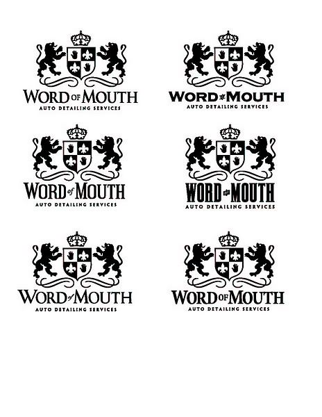 Word of Mouth Detailing
A man with experience is not at the mercy of a man with an opinion
-
11-01-2006, 12:09 PM #25
- Join Date
- Apr 2006
- Location
- Maine
- Posts
- 732
- Post Thanks / Like
from those the first one looks best to me.
Detail ME
05 Tacoma TRD sport
99 Audi A4
-
11-01-2006, 12:13 PM #26
- Join Date
- Sep 2002
- Location
- NE Ohio
- Posts
- 86,984
- Post Thanks / Like
Yeah, either the first one (upper left) or the last one (lower right). I kinda like how theh "auto detailing services" looks bolder in the last one.
-
11-01-2006, 12:55 PM #27GOT PREP?
- Join Date
- Feb 2003
- Location
- memphis, 10
- Posts
- 3,698
- Post Thanks / Like
Originally Posted by Accumulator
My initial thoughts were to use the first "WOM", but use the last "Auto Detailing Services."
Thanks guys!!!Word of Mouth Detailing
A man with experience is not at the mercy of a man with an opinion
-
11-01-2006, 05:51 PM #28
- Join Date
- Apr 2006
- Location
- Houston, TX
- Posts
- 385
- Post Thanks / Like
wow looks really good.
Mobile Auto Detailing
-Tu Nguyen
-
11-01-2006, 06:06 PM #29
- Join Date
- Sep 2006
- Location
- San Clemente, CA
- Posts
- 93
- Post Thanks / Like
I say bottom left
-
11-01-2006, 06:30 PM #30
- Join Date
- Oct 2013
- Posts
- 971
- Post Thanks / Like
I like them all better than the other font you had. Nice job :clap:

 Reply With Quote
Thread Information
Users Browsing this Thread
There are currently 1 users browsing this thread. (0 members and 1 guests)
Similar Threads
-
Feedback wanted on New Logo...
By MusicMan in forum Click & Brag -The Detailers ShowcaseReplies: 7Last Post: 01-10-2012, 01:05 AM -
Finally a logo, please give me your feedback!
By kapinnn in forum Professional Detailer General DiscussionReplies: 19Last Post: 07-13-2007, 02:04 PM -
Feedback on Business Cards & Logo / Insignia
By mcnab in forum Professional Detailer General DiscussionReplies: 15Last Post: 03-17-2006, 05:30 AM -
revised logo! feedback needed!
By blackntan in forum Professional Detailer General DiscussionReplies: 8Last Post: 04-12-2005, 12:43 AM -
Pick a logo...any logo!
By Advantage in forum Auto Detailing 101Replies: 27Last Post: 09-14-2004, 02:57 PM
Bookmarks