

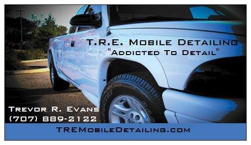
So decided to make some business cards. Here is the first one. Im also going to make one with a Yellow Neon SRT4 and Red or Blue Dodge Viper using basically the same layout. Thought it be nice to kinda switch up the cards. Anyways heres how the first one came out. Whatcha think? Anything you see i should add or change before i order them? I wanna keep them pretty simple.
Results 1 to 15 of 15
Thread: Business Cards
-
04-29-2007, 01:49 AM #1She'll Buff Out


- Join Date
- Jan 2007
- Location
- Sonoma County, CA
- Posts
- 186
- Post Thanks / Like

Business Cards
-
04-29-2007, 07:57 AM #2a.k.a. Troy@DetailCity


- Join Date
- Jul 2005
- Location
- Sarasota, FL
- Posts
- 2,882
- Post Thanks / Like
Re: Business Cards
You sure you don`t want to make "Addicted to Detail" your business name?
Cards look good. I believe it helps to have something on your card that reminds them of your business like a logo, your truck, or even a picture of you.
Troy
-
04-29-2007, 10:35 AM #3She'll Buff Out
- Join Date
- Jan 2007
- Location
- Sonoma County, CA
- Posts
- 186
- Post Thanks / Like
Re: Business Cards
I did a search last night and someone already has a the name "addicted to detail" but its not in california. Im not sure about the laws on fictitious names. If its not in the same state, can i use it? Originally Posted by Troy@DetailCity

-
04-29-2007, 11:04 AM #4

- Join Date
- Jun 2004
- Posts
- 3,968
- Post Thanks / Like
Re: Business Cards
Maybe you could use "addicted to details"
"J"
-
04-29-2007, 12:05 PM #5Hail the power of Quattro

- Join Date
- Jan 2005
- Location
- Jacksonville, Arkansas
- Posts
- 2,767
- Post Thanks / Like
Re: Business Cards
That`s what I was thinking too. The business card design isn`t bad, but I think it may be a bit too busy. I guess I`m just a fan of a formal layout. Originally Posted by jaybs02
If you can read this, thank a teacher. If you can read this in English, thank a soldier.
-
04-29-2007, 12:36 PM #6Formerly TexasTB

- Join Date
- Oct 2005
- Location
- Georgetown,Texas
- Posts
- 2,539
- Post Thanks / Like
Re: Business Cards
Troy, why don`t you make one of your world class cards for him........ lol
"In the business world, the rearview mirror is always clearer than the windshield."
-
04-29-2007, 12:51 PM #7a.k.a. Troy@DetailCity
- Join Date
- Jul 2005
- Location
- Sarasota, FL
- Posts
- 2,882
- Post Thanks / Like
Re: Business Cards
Probably. There are plenty of Dr. Details out there. We have two in our town. Originally Posted by MoparAddict
One spells it Dr.
the other spells it Doctor
so they both have the same name.
I forget the term but a company can file a business name Nationally but it isn`t cheap and most detail companies don`t do that unless they are a franchise.
If there aren`t any in California you would most likely be safe to use it.
Troy
BTW, the name addictedtodetail.com is taken so that might not be a good choice after all, if you wanted to have a website.
-
04-29-2007, 12:55 PM #8a.k.a. Troy@DetailCity
- Join Date
- Jul 2005
- Location
- Sarasota, FL
- Posts
- 2,882
- Post Thanks / Like
Re: Business Cards
I would but my creative juices are being used right now. I`m busy making a newsletter for the store. Originally Posted by TexasTB

Troy
-
04-29-2007, 11:30 PM #9She'll Buff Out
- Join Date
- Jan 2007
- Location
- Sonoma County, CA
- Posts
- 186
- Post Thanks / Like
Re: Business Cards
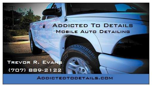
Never thought of that. Think im gonna use that. Kinda sounds better to me too. Originally Posted by jaybs02
There is kinda alot on the card. Im a fan of normal cards too but I was talking to a buddy of mine who owns a shop. He said try to make your card stand out from the others, something that catches their eye. Once i get a good client tell, i can tone it down a notch lol. Originally Posted by audiboy
I asked my boss today about this. I can use the name long as it isnt within the same state. Im only going to advertise in only 2 countys too. I went to the county office to see how much it cost to file for a fictitious name, it was only $45 not bad at all. For the website i just ran addictedtodeatails.com and its open, looks like im in luck. Originally Posted by Troy@DetailCity
Thanks for everyones help.
Revised card
-
04-30-2007, 07:44 AM #10Poorboys Rules!

- Join Date
- Jun 2006
- Location
- St. Louis, MO
- Posts
- 786
- Post Thanks / Like
Re: Business Cards
Hope you don`t mind if I offer my `professional` opinion, since I`m a graphic designer.
I think the layout is a bit busy. The company name gets kind of lost over the truck. Maybe try adding a white border around the text and make it a bit bigger/bolder. Depending on the software you used, you could put a slight fade over the picture to allow more contrast behind the company name.
There`s always the option of putting the picture on one side or the other and having you name and contact info on a solid color background for easier readability.
What you have is nice...just a little busy. As I said, it`s just my professional opinion...take it however you want.
I do this kind of thing for a living, so I`m critical of design like you all are critical of a perfectly detailed car.
Here are a few samples of cards I`ve done to maybe help spark some more creativity...

http://tmooregraphics.com/media/cards_HPP.gif
http://tmooregraphics.com/media/cards_larimore.gif
Also...a very nicely designed `logo` can really set you apart from others, but there`s quite a bit of cost involved in a professional brand image.
Good luck...I`m anxious to see what you end up with!
-
04-30-2007, 09:58 AM #11She'll Buff Out
- Join Date
- Jan 2007
- Location
- Sonoma County, CA
- Posts
- 186
- Post Thanks / Like
Re: Business Cards
Originally Posted by YNOT
Dang, those cards look hella sick. Im not very good with computers, what program did you use? Thank you for your input, i need all the help i can get.
-
05-04-2007, 01:08 PM #12
- Join Date
- Nov 2005
- Posts
- 373
- Post Thanks / Like
Re: Business Cards
mopar
the contrast is really good, with the white and black
i also like the strip at the bottom....i would make the letter on the truck a little bigger and maybe bolder.....overall definitely not bad
i give an 8 out of 10
-
09-11-2007, 06:40 PM #13
- Join Date
- Mar 2007
- Location
- Dartmouth Nova Scotia
- Posts
- 13
- Post Thanks / Like
Re: Business Cards
I have to agree with YNOT. I have a Diploma in Digital Media design and I find the truck is a little distracting. My teacher always said. "Keep it simple, A simple design is more attractive than a complex design" Like YNOT "Sharp Cars" business card. The logo is big and bright, its the first thing you look at. Which is good, you want people to see what your business is.
The contact information is bold and stands out, easily readible.
No nead to explain in text what he offers or does because the pictures explain the work. If you dont want to use a picture keep the text simple and brief. Dont put a life long story to clutter up the card.
The blue line divides the Logo and contact information from your description.
Perfectly designed card accually lol. you look at Logo, contact info then the picture.
Best thing to do is come up with a few designs on the same page (if you use adobe illustrator or something similar" look at the few designs, Pick THREE of the ones you like and show them to your fam, friends or even here on DC and get opinions on whats easiest for the "customer" eye to see.
Hope this helps
Matthew
-
09-11-2007, 09:18 PM #14Poorboys Rules!
- Join Date
- Jun 2006
- Location
- St. Louis, MO
- Posts
- 786
- Post Thanks / Like
Re: Business Cards
Thanks Matthew for the compliments on my `Sharp Cars` card.
I actually might know of someone who was contacted by Trevor to design some cards for him...
I also think that he was more than pleased with the new and final design that I..or I mean... someone...did.
-
09-12-2007, 05:17 AM #15
- Join Date
- Aug 2007
- Posts
- 52
- Post Thanks / Like
Re: Business Cards
YNOT - Nice work.

 Reply With Quote
Thread Information
Users Browsing this Thread
There are currently 1 users browsing this thread. (0 members and 1 guests)
Similar Threads
-
New business cards!
By metal in forum Detailing Business Management & MarketingReplies: 24Last Post: 06-20-2008, 07:39 AM -
Business cards
By joe.p in forum Auto Detailing 101Replies: 9Last Post: 05-22-2006, 12:20 AM -
Starting business in NJ and getting business cards (need legal advice)
By PaulTso in forum Professional Detailer General DiscussionReplies: 6Last Post: 05-25-2005, 07:19 PM -
starting business in nj and getting business cards(need legal advice)
By PaulTso in forum Auto Detailing 101Replies: 9Last Post: 05-18-2005, 03:19 PM -
Your Business Cards
By KCPreki11 in forum Professional Detailer General DiscussionReplies: 6Last Post: 07-08-2002, 02:57 PM
Bookmarks